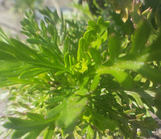
 |
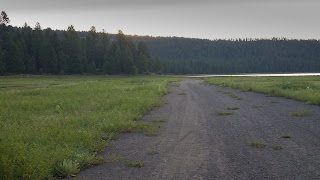
| Edited |
 |
| Original |
- The qualities that I admired in Mac Stone's photos were:
- The stories behind the photos
- The depth of the subject, foreground or background
- The obvious subject in the photo.
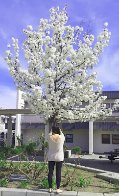
- The quality I like most in my photo is the obvious subject.
- I think my shot is amazing because it wasn't the shot I was going to initially use and I didn't think that into planning to this photo, I just did a point and shoot and the picture turned out better than I thought.
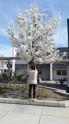
- I used the grid on the camera hack to take the photo so I could use rule of thirds. I also adjusted the hues of the photo by using a hue and saturation layer. Lastly, I cropped the photo to fill the scene with only the subject.
- This was a challenge because I didn't just want another photo of the school, I wanted to put something into the school to add interest to it.
- Element of art- Space
- Principle of Design- Proportion/Scale
 |
| #1 |
 |
| #2 |
 |
| #3 |
Responses:
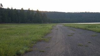
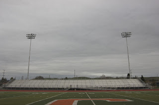
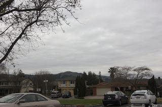
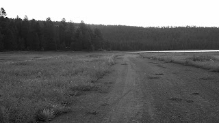
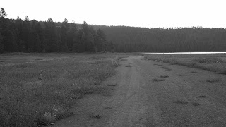
- I did try to use the rue of thirds and in photos #2 and #3 I focused on the sky and in photo #1 I emphasized the land.
- I used proportion in #3 to show the different sizes between the cars and the houses. I also used rhythm in photo #1 with the repetitive trees in the background.
- Photo #1 was taken before sunrise and photos #2 and #3 were taken mid day. I think these were bad times to take photos because the lighting was off.
- I don't think I did a very good job with the foreground and background relationship. My pictures have objects in the background but not many in the foreground.
 |
| Burned Edges |
 |
| Channel Mixer |
 |
| Lab Color Method |
 |
| Gradient Map |
 |
| Desaturation
|
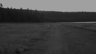
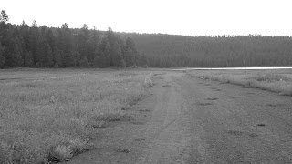
Responses:
- I think the Gradient Map produced the best result.
- I did not achieve a big value range for all of them, only Gradient Map and Desaturation gave me a good value range.
 |
| Macro |
 |
| Fisheye |
 |
| Fisheye 2 |
Responses:
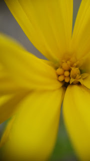
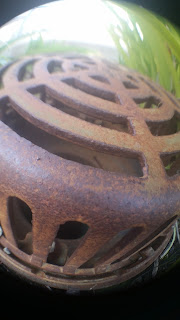
- I personally liked using the macro lens because it shows a lot of detail and texture in the photo even though it took a little bit of time to get it focused on the right spot.
- My favorite shot was the macro shot because the focus was on the tiny flower inside the big flower.
- The fisheye 2 shows the best rule of thirds because the focus is dead center.
